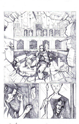
 This one page(Page#3) of many in which I will post as the month goes by. I really want to hear some feed back before I lay down the inks. Like for example: where would a cast shadow sit on Diablo in panel#1?
Personally I'm not too crazy on panel#2 and already thinking of another option.

8 comments:
dude.
that first panel is sweet. totally grabbed my eye and wouldn't let go.
Not sure about the cast shadow though. If the light is sourcing from behind, then most of his body and face might be in shadow? I picture a ton of Mignola black, with his eyes left white...
Yeah that first panel is great, looked like it took you a long time. I'm having issues with the last panel. It took me a while to figure out what it was. I think you need to clearly define the hole, like you did in the other drawings. Also, I think the hole may be a little smaller and show less face, after looking at panel 2 - or you could solve it by making the hole bigger in panel 2.
Well the last panel is supposed to be our characters reflection off the glass of the picture of ST. George.
This is a reference a photo I used.
http://i186.photobucket.com/albums/x210/jskociuba/DSC01426.jpg
Would look different if it inked and 2 toned?
Ah, ok now I see it. I thought it was his face looking out through the hole in the painting.
Hmm.. I think you have a continuity problem there. Where is the painting that he's looking into? Maybe you could draw it in the background of the second panel.. so he's looking over? If that's where it's supposed to be be.
Maybe the dude's face in the painting should be subtle and less detail, so it doesn't compete with the painting. Where is the painting shown in panel 1? Does he see Diablo as the painting of the man with the spear?
I agree with LooBot here ...
The face in the 3rd panel does stick out quite a bit ...
Love the first panel though ...
I love the concept. You shold DEFINETLY use tones for that one to make it absolutely clear. It won't seem clear otherwise. I would think that with complex P.O.V. scenes it would be best to provide the audience with samples of reflections in previous pages (as you have shown with the one above) as if to simply introduce the reflection motif so they can clearly understand what you can do with it later. Also a computer can help you do the best possible job of making a complex transparency.
Aaaahhhh ... good point Zen ... transparencies is a good idea ... very handy ...
Post a Comment